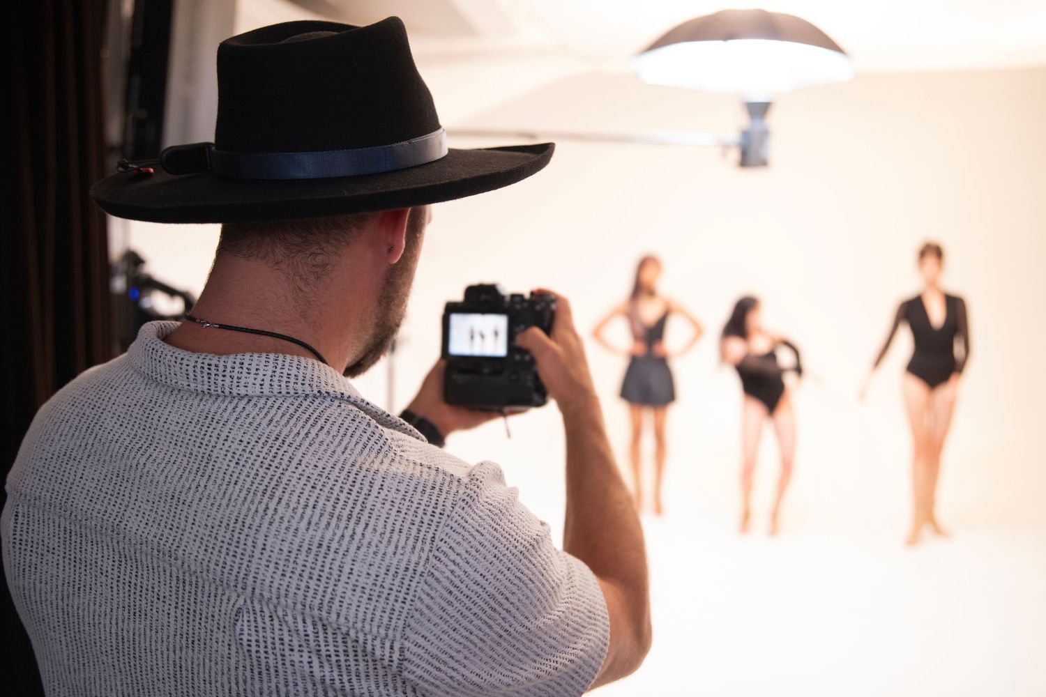
Bay Two was our RGB portrait lighting bay at the Sony Alpha Collab in Seattle, and it was built around one question from color theory: why are these colors here?
Turning on RGB lights and making something colorful is easy. Making color mean something is harder. That was the challenge, and the 65 photographers who moved through this bay took it somewhere I never expected.

Where the Idea Came From
This was our Lindsay Adler bay. What stuck with me from her color theory class was one line: color should have a reason. The question isn’t whether something is colorful. It’s why those colors are there.
The RGB Lighting Setup
- Backdrop: middle gray seamless paper, neutral enough to take on whatever color hit it
- Color: four Nanlite PavoTube 30C tubes on stands and booms around the subject, angled in V and X shapes
- Key light: Nanlite 60 bi-color with barn doors, putting just a touch of light on the face so the eyes still carry the colored catchlights
- Haze: a few groups brought the Smoke Ninja over from Bay Three, and the color came alive in the air
Camera settings: the same as every bay. f/2.8 to f/4, around 1/250, ISO set to taste, 5600K, RAW. Here’s why we kept them the same.


A Quick Color Theory Lesson
Analogous
Colors that sit next to each other on the color wheel, like pink, purple and blue. They feel cohesive and moody, wrapping the subject in one feeling. This is where I started the tubes.
Complementary
Colors opposite each other on the wheel, like blue and orange. They create contrast and energy, and they fight for attention. Groups switched to these throughout the day to feel the difference.
Color is not just decoration. Color communicates.


Let the Light Into the Frame
Once the bay was handed over, groups pushed everything warm, then everything cool. A few made something that felt wrong on purpose, just to see why it didn’t work. That part taught as much as anything else.
The tubes didn’t have to hide, either. Some of the strongest portraits from this bay framed straight through them, with the light itself becoming part of the composition. Two things worth trying:
- Move the person, not the light. One step forward or back changes how much color lands on the face.
- Turn the key off. Some groups killed the Nanlite 60 entirely and let the subject fall into color and shadow. It completely changed the mood.
Even when the color got wild, the person still had to feel visible and connected. That was the one rule.
The Moment That Stuck With Me
A photographer told me Sony had put a camera in their hand in this bay, and now they want to buy it. They never would have picked it up on their own. That’s what a day like this is for: trying the thing just outside what you normally reach for.
Try It Yourself
Pick colors that sit next to each other on the wheel, and
let one soft light touch the face so the eyes still connect.

Thank You
The lighting in this bay was provided by Glazer’s Camera, and Sony kept Alpha gear moving all day so people could try something new. Read the full recap, or start with Bay One.
Next Saturday: Bay Three, with pumpkin heads, a cauldron and fog.
Want to experiment with color in person? Join our newsletter for first access to open studio days in Pioneer Square, starting January 2027, and follow us on Eventbrite.
Frequently Asked Questions
What is an analogous color palette?
Analogous colors sit next to each other on the color wheel, like pink, purple and blue. They feel harmonious and moody, which makes them a great starting point for RGB portraits.
What’s the difference between analogous and complementary colors?
Complementary colors sit opposite each other, like blue and orange, and create contrast and energy. Analogous colors create harmony.
Why use a gray backdrop for RGB lighting?
Middle gray is neutral. It takes on whatever color you throw at it, so one backdrop can become any color.
Do I need a key light with RGB tubes?
Not always. A small, controlled key keeps the face readable and puts catchlights in the eyes, but turning it off can create a more dramatic, color-only look.